Wednesday, April 25, 2012

The Future of Comics - Extended Response

Last week I discussed my experiences reading Octopus Pie. This is a web based comic that still maintains the feel of a print comic strip. It is interesting that I took this class and it still maintains ideas about the future of comics that I have encountered in my studies as a graphic design student at Ringling. 


As previously discussed, in the fall of my junior year, I took an interactive zine class where we had the assignment to create a print zine for a specific subculture and then create a digital version as well. In addition to actually designing, a lot of the class involved discussing how print can be interactive beyond the basic "page turning" and how print is and will be viewed now that there are so many digital channels for information to be presented. 


I also participated in an internship at the St. Petersburg (Tampa Bay) Times last summer. Again, in this every growing digital society, there was much discussion on how to keep consumers interested in a print edition of the paper. A lot of my knowledge of user interface, experience and web design knowledge was used during my time there because the Times seemed to understand that they will not survive in a print only channel. They are migrating to more digital applications.


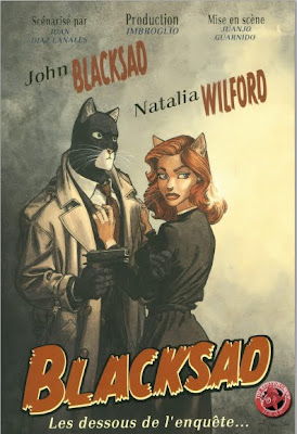
How print is viewed has changed. With the newspaper, because it is daily and newsprint is cheap, like Pulp Fiction, it seems to be regarded as disposable. In magazines, much like comic books, it seems that the print version is coveted as a tangible item that can be collected.


Though the world of comics is varied and vast, like the subculture zine I created, comics are still for a specific audience, though that audience is growing. I think that a transition into a digital environment will help that situation. For one thing, the internet connects to most places on the planet (I know, crazy right?) so comics in digital form could be delivered to more people a lot quicker.


The most interesting concept for comics in a digital environment is the idea of inserting rich media. As a graphic design student, we have discussed digital interactivity quite a bit. When looking at interfaces of digital versions of magazines, there are opportunities for graphics and charts that would be static in print to move and become interactive. The same discussions were held at the Times about their website and applications. Like I discussed in my Octopus Pie post, there are so many possibilities for this kind of interaction in web and digital comics. Though Octopus Pie author Meredith Gran chooses to keep her work simple and in strip form, I can see comics writers choosing to use touch screen motions for interactive panels and animated panels that would add to the movement, excitement and appeal of comics and graphic narratives.


As with all things too much of this could be a bad thing. What will be interesting to see is the change in how comics writers choose to balance still and moving/interactive panels and how writing will change when the author must choose the right places for interaction.


This class has been great for me. I have had interaction with most of the basic comics (strips, superheroes, the popular graphic novels) before this class. Though I learned so much about the history, structure and process of comics writing, what I enjoy the most is how this class made me realize how vast the world of comics really is. I think that most people immediately jump to the stereotypical hero in tights when the hear "comic books". What I now know is that comics don't only include science fiction stories about super-humans or little trouble-making kids and their dogs. A lot of comics are stories about real people with real issues, based on events in their lives. Or some comics are meant to make statements about social and political issues. Or event present philosophical and conceptual ideas.


The point is that this medium is perfect for communicating dynamic and engaging stories and I think that the future of comics in digital realms can only extend how vast this world is. I look forward to seeing what comes next.


Wednesday, April 18, 2012

Web and Comics? WHAAT? Octopus Pie

Octopus Pie has been on my radar since a class I took Fall 2010 my Junior year. I took a class about interactivity in print and its transition into the digital world. We discussed comics and graphic narratives on tablet and digital devices. Web comics was a part of this and I was able to check Octopus Pie out then. Unfortunately, I have not looked at it since until this posting. It was refreshing to go back to comic strips and quick reads after looking at graphic novels and longer stories.
The first thing I notice about this is that even though I am viewing this comic in a web browser, the experience is very much like that of a print comic strip. Though there are seemingly endless possibilities for interaction in the digital realm, you read this strip panel by panel. Meredith Gran only shows the reader a little at a time and doesn't overwhelm you with the possibilities. I also get a similar feeling to a print strip from the fact that even though there is a continuing storyline, each strip has a gag setup the ends it nicely. The visual style is flexible, curvy lines that create excellent movement so the reader is kept interested even though it is only black and white. Octopus Pie is entertaining with fun art and amusing characters. I look forward to see what will happen and how it will adapt in more interactive realms.

Reconsidering the Superhero


Alan Moore. Hmmmm. An interesting character.

This week we were asked to look at some of the newer ideas of superheroes. I think that when the word 'superhero' is thrown around people immediately think of an all american good boy in tights (tight tights) that can do anything. They are not always relatable. When looking at Alan Moore's works, Watchmen, etc. or Arkham Asylum (Batman reconsidered), I think that there are many ways that these "heroes" are more relatable to the reader. Most notably these characters are way more developed. There are layers to them that allows the readers to see the flaws and not only the glistening exterior. In many cases, like my favorite, V for Vendetta, the hero must do something much darker or harsher in order to do good. They are not necessarily all clean and shiny, almost like anti-heroes. The line between who is the hero and who is the villain may be extremely blurry. Overall, the tone of the worlds these "reconsidered superheroes" inhabit is much more dark and grimy than the golden metropolises of yesteryear. I think that this was the most interesting assignment for me because for some reason I relate to these the most. They are still fantastic enough to keep me interested but the characters are so human and relatable.


Response to Phoebe Gloeckner

For week 12, I researched Phoebe Gloeckner after looking at her Diary of a Teenage Girl. I found this to be describable as the quintessential "coming-of-age-in-the 70s" story. I feel like the story is really similar to other stories I've read. The main character, Minnie, goes on a journey of self-discovery as she grows up in the changing times of the 70s San Francisco. Like many coming-of-age stories, she experiments with sex, drugs, relationships and her own character. Though a familiar story, it was by no means boring. In fact, the character development and dark and intense tones were engaging. The story and what Minnie was going through had an element of danger and uncertainty that kept me on the edge of my seat. I found her obvious cartoon inspired style to go along with the story because I felt that she capture the feeling and soul of her characters, especially in facial features. After researching her more and learning of her unique tone, style and notable content in works like A Child's Life and the unique medical illustration work in The Atrocity Exhibition, I am immensely interested in what she has to offer and look forward to find out more.


Wednesday, April 11, 2012

In Class: Graphic Fiction

In class week 12 was fun because we were able to get a small introduction to the very, very wide world of graphic fiction/non-fiction. We were given an assortment of graphic novels and comic collections and asked to quickly look at them and get a feel for them. I was given King of the Flies: Vol. 1 Hallorave. I was immediately drawn in by this story, or series of intermingling story lines. It was interesting because you are first introduced to the main character (the self-proclaimed King of the Flies) on his way to a halloween party in some rural cornfield with his friend and his friend's girlfriend, whom he is into. On their way to this seemingly normal event, there are some surreal elements because they are taking drugs. The graphic quality of the imagery helps to support the idea of his head feeling like it was going to explode. Just when I was getting into this story, it switches. Though we had a limited amount of time to read, I came to understand that there are several story lines set in suburbia that seem like they have nothing to do with each other but end up interconnecting. I really want to read more.


What I am intrigued with is that this a noir story, which I have already read in this class. It seems that noir style stories fit well into the comic form. Even though their visuals differ greatly, both Blacksad and King of the Flies create engaging noir stories.


Tuesday, March 27, 2012

Comics as Contemporary Literature


For this assignment I read Asterios Polyp. The most obvious way that we can take this graphic novel, treated like any other comic visually, with a series of panels, an give it the title of contemporary literature is how deep, insightful and complex the work is in it's content. It plays with several levels of tone and varying structure, by using flashbacks and alternate characters' points of view, and theme. There are several kinds of conflict from a storytelling point of view: man vs. man, man vs. environment and most often man vs. self, as Asterios Polyp's struggle is mainly a journey within him self, even thought there is a physical journey that pushes the narrative forward. In addition to conflict there are several plays on the idea of natural and man made dualities and variations. I enjoyed the visual quality of the novel because in plays and reinforces these ideas. There is a juxtaposition of high contrast graphic shapes and the messy line drawings. The varying styles help to support the themes of perception of the world through varying points of view.


Wednesday, March 21, 2012

Osamu Tezuka's Buddha

This was my first experience with Tezuka and one of my first encounters with manga (thankfully it was the American version so I did not have to figure out which way to read it!). I decided to read Buddha, which, no pun intended, was very enlightening. It taught me not only about manga in general but, like my earlier reading of King by Ho Che Anderson, showed a different interaction with an historical figure that is often made out to be quite "pure." I was very excited to read Buddha because of my interest on the subject. Unfortunately I was only able to read Vol. 1, but I would definitely be up for reading further. The retelling of the life of Buddha proved an interesting read. I enjoyed some of the more humorous aspects of the tale, however I found it odd that for something with such a rich visual heritage, Tezuka chooses to use black, white and cross hatch shades of gray to create this world. That being said, there is a good use of contrast and dynamic movement to create visual interest. Overall, this was not my favorite representation of a deeper subject matter I have encountered this semester.

Thursday, March 15, 2012

Sita Sings the Blues/ The Triplets of Belleville


In class today we watched about 30 minutes of the animated film Sita Sings the Blues. This was an animation that has roots in the animators personal experiences with her relationship. It was at first confusing because there were several different story lines that each had a different visual style. However the styles were intriguing - from cutout to rough line drawings. I also enjoyed the narrators' conversational style. It was enjoyable that they were not perfect in their knowledge of what they were talking about or even their pronunciations of names and places.


We also watched about the same amount of time of The Triplets of Belleville. This was super exciting because I have always wanted to watch this and it has been suggested to me many times. I really enjoyed the visual quality of the animation. The caricature-like drawings were amusing as well as the gags set up. I was intrigued by my ability to follow the story even though there was a significant lack of dialogue.

These were my first interactions with both films and I would absolutely love to see more of them.


Wednesday, March 14, 2012

A Wide World of Comics

This was an interesting week because we were asked to look at comics that were not written in English for American/ English speaking audiences. For this assignment I chose to look at the comic album Blacksad (Quelque part entre les ombres) by Juan Diaz Canales and Juanjo Guarnido. Though written/illustrated by Spaniards, Blacksad is intended for a French audience. This was amusing for me since I don't speak French so what I picked up from reading it came from guessing based off my knowledge of Spanish. However, the flow and character illustration allowed me to understand what was going on. The illustrative style is very different from what we have encountered before. The drawings are much more detailed and don't rely on line quality as much. The amazing visual quality to Blacksad often proved distracting because I often found myself becoming caught up in the images for many of the panels. I laughed at how the authors, like so many comic authors, used animals in place of humans to emphasize human characteristics.

What I loved the most about these were that they hearkened to classic film noir or detective serials, which I really adore. The setting, characters (especially the hard anti-hero John Blacksad) and story lines make it seem like it could be a storyboard for a movie.


Thursday, March 1, 2012

Stereotype and Representation: Response to American Born Chinese and King

This entry is about stereotypical representation in comics. I likened American Born Chinese by Gene Luen Yang to Blankets in some ways, mostly the adolescent character figuring out who they are except that this deals with being born into an specific ethnic minority. The breaking up of the stories into three different parts helps to solidify this idea of more than one side of a person; the classic influence of culture and family ties and the more contemporary melting pot scenario. For example, the juxtaposition of the classic chinese folk-tale of the Monkey King and the more modern day story line of Jin and his troubles of fitting in at school. Though Gene Luen Yang definitely toys with ethnic stereotypes (see below), I adore the graphic visual quality of the American Born Chinese.


King by Ho Che Anderson has been one of the most striking reads for me all semester. A biographical depiction of the life of Dr. Martin Luther King Jr. it is interesting that Anderson's portrayal of King is a tad edgier than the King that is presented to the world and that we get to hear different views on him as well. Working with the different side of King is the visual style, which I think is brilliant. I love graphic style and experimentation and my favorite panels are the ones with simple extreme contrast black and white. Perhaps I am too conceptual a thinker but I love how in those panels because of the contrast there is little difference in skin tone is an amazing device to make the point that there is no difference. Skin is skin. Brilliant!


Response to Barefoot Gen

The in class showing was the first time that I had ever even heard of Barefoot Gen. I was intrigued by the story but didn't fully understand what I was watching until about half-way through. I enjoyed the pairing of this film with Maus by Art Spiegelman. It was really fascinating to compare to pieces of graphic narrative that were not only about the same time period but were also biographical/autobiographical. Though not exactly about the same event, they were about atrocities against humans by other humans.

The film starts us off by meeting Gen and his family. They are in an uncertain situation; food is an extreme issue because of rationing and because his mother is pregnant with a fourth child. Though there is some issues for the family, for the most part they are happy and all seems right with the world. Until one night when a plane flies over and they must get into a bomb shelter. At that point I would begin to understand the situation and what would happen.

HOWEVER, I was not prepared when the bomb was dropped. The visual style was fairly light hearted until that happened. When it was dropped, not only did the tone of the story change but the depictions of what happens to a person in a nuclear blast were extremely factual and detailed. I was caught way off guard especially in the morning class! This amount of realism brought me back to the truth of what happened to these people. It was really interesting to see the transitions between the life of Gen and then the horrors of the fallout/war.

This was a great follow up to Maus to show how comics/cartoons/anime can talk about legitimate issues in a genuine and meaningful way. I look forward to eventually watching Grave of the Fireflies to also compare with these two pieces.


Reponse to Maus

Maus Vol 1 & 2 by Art Spiegelman was an interesting read for me because The Holocaust seems to keep popping up into my life. I have done numerous studies on it and taken three classes. The most compelling part of my Holocaust studies was when I had to do an art project on it my freshman year of high school. We took a trip up to the Holocaust museum in St. Petersburg and were then asked to use our artistic abilities to create a tone and tell a story about the Holocaust.

I really made a connection to Maus because this is what that project was all about: an artistic expression of how the experiences of the Holocaust affected lives. It just happens that this is also a biographical story being told as well. The most intriguing thing for me was that though the subject matter was extremely heavy, I often did not feel like it was weighing me down. I would certainly attribute that to two things. The fact that the piece is a comic takes you out of the reality of the situation. I think it maybe that preconceived notion that comics aren't serious, which of course can be challenged. However the fact that Spiegelman used different animals to differentiate between ethnicities, nationalities and even vocations lent itself to the fantastic quality of Maus. Every kid knows that the personification of animals is endearing. I would like to think this was deliberate to showcase that the story is being imagined throught the eyes of a child. Visually I think the line quality is very fluid. There is a lot of motion just in his use of line and shading. What I think is brilliant is how Spiegelman has used panels to crop and showcase specific moments of great significance.


Example of using cropping to frame.


Though there were obvious creative liberties with the visual quality of Maus, what throws you right back into the seriousness is the story itself. From the behavior of the father, a cold and difficult character because of what he went through, to the events that happened to him, the story is still about how a human being survived a mass extermination of an ethnic group by another group of human beings.

After reading Maus I have decided that it was a very enjoyable read and another engaging Holocaust study. I think it was an alternative view of the Holocaust that just adds to the poignancy of what happening to so many people, including the father of Art Spiegelman. It was brave and very touching for him to take on a project like this.

Wednesday, February 29, 2012

Response to Underground Comics


It was not a far stretch for me to assume that underground comics were going to be different from anything else we have read for this class, they are underground for a reason. It must be taken with a grain of salt. A great deal of the content deals with sexual situations and drug use, which hearkens to the time in which they were written, a time of breaking free from normal conventions. But also a time of people trying to keep that kind of stuff away from mainstream media.

It is obvious that the artists and writers of underground comics had fun. Along with the thought provoking (ahem) subject matter, most of the comics that I looked at have a fun loose quality to their line work - nothing seems to be taken too seriously.

While there is a loose quality to these comics, within the writing a lot of them send to be satire or cynical in some way. There is an edge to them that goes with out saying when something is not mainstream. They are thought provoking,innovative and even controversial. A very enjoyable study.


Wednesday, February 8, 2012

Response to Blankets - Craig Thomson

I was extremely excited to read Blankets because I have been told countless times by many of my friends what an amazing and enjoyable read it is. So without any pressure whatsoever, I sat down to read it.

I found it interesting that there is a similar quality to the visuals of both Craig Thomson's work and Will Eisner's in that they are black and white and both have line quality that is extremely kinetic. While Eisner's is much more sharp, there is a gentler, softer quality to Thomspon's. I found his characters to be charming, simple and iconic. His illustrations are also very emotive in that the reader doesn't only understand the action taking place, they get the feeling of that character and their reaction to the situation.


The story was one that almost every person, including Thomson since it is fairly autobiographical, can relate to when moving from childhood into adulthood. It deals with subject matter like bullying, faith and love. Like discussed in McCloud, it seems to be a good thing that his characters are simplified so the reader can connect themselves with Craig's adolescent experiences. Everyone has felt out of place and longing for someone who won't connect in the same way. Though the comic doesn't necessarily end on a high note like most would like, it does teach a life lesson of the more likely scenario. It's bittersweet.

It is better to have loved and...


Response to Will Eisner - A Contract with God


When I read the assignment on the Literature of Comics Blog to read some Will Eisner, I already had what my response would be in my head. I assumed based on the look of his signature and his name being the same as Michael Eisner, that he would be a part of the Disney family, like Carl Barks, and have works that were wholesome and have talking animal of some sort. When I started to read "A Contract with God", I realized immediately that I was wrong based on the first illustration of a group of people walking toward an old building or even perhaps the scenes of sexual activity later on.

I first found it interesting that there were multiple short stories that were extremely solemn and seem to be put together for a bigger meaning. They have a little bit of a more mature tone to them talking about spiritual beliefs and the everyday lives of those in the tenements of the Bronx. After doing some research it is obvious that Eisner takes some inspiration from his experiences growing up there.

I really enjoyed that there is really no structure to the panels, if you think of it in typical comic layout. Most of the illustration are free on the page and not contained by a bounding box. I think that this works really well with Eisner's illustration style, which has a lot of movement because of his use of lines. I also enjoy how he uses light and shadows for emphasis since he doesn't use color. My favorite touch is when he works with expressive typography next to the illustration, not just the normal "comic book type".


Wednesday, February 1, 2012

Response to Early Comic Books: EC, Barks and Herge

This was a great assignment, not only because we were asked to read comics books as an assignment but because I was able to reminisce about my experiences. It was interesting because all three of the readings assigned I have encountered before. As stated in a previous post, one of my larger projects in my graphic design studio was branding a fictional museum dedicated to Comics. While conducting my research I stumbled upon EC comics, though I may not have known it at the time. I was pleasantly surprised when I was able to recognize some of the covers and styles during this assignment. remember wanting to read them then and now I was able to. I am most intrigued by the Tales from the Crypt series, which is the most notable and recognizable, especially because of the TV show adaptation. It was certainly a part of my childhood. Disney was also definitely apart of my childhood and it was super interesting to discover that the character of Donald Duck and his many forms (Uncle Scrooge, etc.)r was a comic book and drawn by Carl Barks.

The most exciting part of the assignment was the Tintin readings. I understand that Tintin was never that popular in the United States, which I find really unfortunate. I was introduced to Tintin by my grandmother around the same time as my father introduced me to Indiana Jones. I just remember associated the two of them because of their obvious sense of adventure and dynamic stories. I find the character of Tintin relatable and engaging, his youth and intellect allowing him to outwit opponents and solve mysteries. There is also an endearing quality to the illustration style: simple, yet effective.

Thursday, January 26, 2012

Response to Comic Strips

Comic Strips are easy to love...

It is simply amazing how attached we can get to a little series of boxes that takes no time at all to read. However with each "episode" we remeber and empathize with the characters and their shenanigans. This week's reading assignment was a simple joy to partake in. Most likely because the very idea of reading comic strips just brings back memories for me; which I imagine is true for a majority of people.

Like many people my age, my encounters with newspapers have been limited. However in high school, the local paper gave the school a pile for the students to read and become involved with. Being in high school, my only interests were the crossword puzzle (I know its lame but I love to do them) and the comics. I remember loving to see what the antics of Hagar, the Get Fuzzy Pets, Bizzaro, of course Garfield, Peanuts and many more would be that day.

What is funny is that, even when we miss them for a time, we can get back into their world instantly. Of course, I graduated high school and when I came to Ringling I don't think I picked up a newspaper until this past summer when I had an internship at the St. Petersburg Times. There were copies of the paper available for employees each day. Even though I missed out for three years, I still felt as though I knew the characters and hadn't missed anything.

This is the amazing thing about comics and what makes a comic strip successful. The idea that is a strip that is about an inch and a half by five inches (I have no idea what the exact measurements are) the reader understands who the characters are and is captured by the events taking place.

Though I have read Calvin and Hobbes before, I have never been introduced to Little Nemo and Krazy Kat. Calvin and Hobbes is always enjoyable. I think that this strip is endearing because of the heart of what is happening. The relationship between the boy (always imaginative and precocious) and his friend a tiger is obviously an interesting one...not only because boy/tiger but their personalities are amusing together. Calvin, who is always getting in some sort of trouble, is balanced by the dry, quick humor of Hobbes. It is also interesting because of how dynamic it is for a comic strip. Though there are antics like any other, it is often very thoughtful and philosophical. Visually it is very dynamic because he plays with different styles to set different tones and show the difference between "real life" and Calvin's imagination. All in all, a super enjoyable comic strip.

Little Nemo was really interesting because of how imaginative and fantastical it is. I really loved the tone, it felt almost like Peter Pan in away. Just pure dreaming and play. Krazy Kat was just cute to me. From what I gather from reading, the story and gag is pretty much the same every time (mouse throwing brick at cat, police dog, etc.) I suppose that this could be become mundane very quickly, but just how it was drawn and the idea of reverse cat and mouse, it just seemed cute to me.

Sunday, January 22, 2012

Response to A Harlot's Progress In Class

The discussion in class about A Harlot's Progress was interesting to me because, like many people I assume, I have seen the series before but have never linked it to the world of comics. It makes sense though. It is a sequential narrative about what happens when a young woman falls into the wrong hands at the wrong time. It is simply amazing how detailed each panel is and that because of all these elements it is easy to infer what has happened "between the gutters" so to speak. What I love about the series is that within those details there are several more stories just waiting to be told, like that of the lover or the clergyman.

Wednesday, January 18, 2012

Response to Scott McLoud's Understanding Comics

Here is a banner series for my Museum of Comics Brand Concept.


Understanding Comics was a very enjoyable read. Overall, the idea that an informative book about comics written as a comic is simple and engaging. In addition, McLoud's writing is amusing with interesting concepts.

The concept introduced in Chapter 2 about humans and how we, as a "self-centered race", tend to see a faces in everything was fairly compelling to me. The idea that there is a simplification of image for reason made me think about some work I had done in my graphic design studio class.

My project was to brand a fictional Museum of Comics and create a proof of concept. Using the idea of escapism I came up with the concept of "Who is behind Your Mask?", which used many of the typical characters you see in comics and hearken to the idea that when one reads a comic book, one essentially becomes part of that world. I applied McCloud's simplification of form to this. Though I didn't mean literally simplifying images, I used the simplification of character. In both of these instances I think people enjoy projecting themselves into these worlds and that is a main joy of comic books. I just like how I was able to connect something I had done in my studio class to what I am reading this semester.


Wednesday, January 11, 2012

Response to The Arrival by Shaun Tan

The Arrival is an amazing story about the journeys we all take. What makes it even more spectacular is that there are no words so the reader relies completely on the graphics.

The basic story line, the journey of our main character to a new land, is understood fairly quickly because of the image treatment and visual elements. Using what is familiar, classic image quality and recognizable images that hearken to the time of Ellis Island, we understand that this is a story about immigration.

This story works without words for several reasons. The first, which I alluded to before is that the basic visual structure is something that we might have seen before. However as our character continues on his journey, elements are included that are much more fantastical, like the creatures and strange language. I think this is rather brilliant because it allows the reader to connect with the main characters story in that we have arrived at a place we do not understand.

Also because there are no words a lot must be read from the images. Each and every image is not wasted. Each one tells a story through composition and often body language, something that we recognize as humans. Even though there is a main character, above that this is a story about stories. Each and every "immigrant" to this strange new land has their own story, which is shown a few times when our main character encounters new people. We recognize that it is someone else's story simply by changing the background on the page. Our main character's story has a white background while others have a textured or darker background. What also keeps the story visually interesting for me is the macro/ micro cropping of images. I enjoy the cadence created between the panels that are broken up with smaller micro images and then we pull back to a larger image. It adds to the idea of strange, new and adventure by giving a sense of scope to the graphics.

This was a great read that appealed to my visual nature and my sense of adventure.